Graphy Review

8.7/10

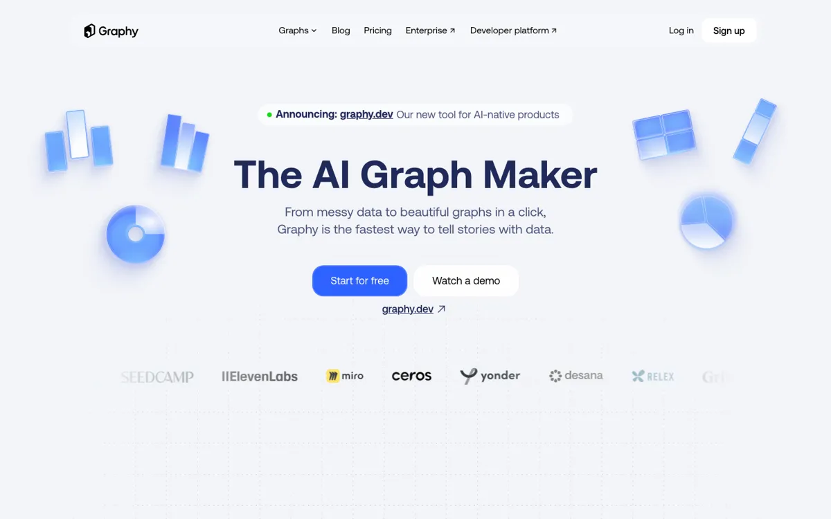
AI graph maker for turning raw data into presentation-ready charts, embeds, and reporting visuals fast.

Review updated August 2026 By The AI Way Editorial 5 min read
Graphy API Available Team Collaboration Web-Based Freemium from USD 16.00/mo

Our Verdict

Graphy is strongest when your team already has the numbers and the real friction is turning them into charts that look good enough to send outside the analytics bubble. The product feels more useful as a communication layer than as a pure chart toy, especially now that pricing, embedding, and API use cases are easier to see. The limit is that Graphy still works best after the data question is settled. If analysis itself is the messy part, this is not the first tool to fix it.

Official site
A free plan is listed; verify current limits before upgrading. Starts at USD 16.00.
open_in_new Try Graphy
Official Website Snapshot Visit Site ↗

check_circle Pros

  • It accepts messy real-world inputs instead of forcing you into a clean-room BI workflow before you can even start charting.
  • Graphy is useful because presentation and distribution sit close to the data step, so a chart can move into a deck, doc, embed, or social post without another toolchain.
  • The paid tiers map to believable workflow upgrades: unlimited charts and AI use on Plus, then refresh, protected links, and brand kits on Business.

cancel Cons

  • The free plan is still mostly a serious trial, not a forever workflow, because five charts and limited AI disappear quickly once reporting becomes recurring.
  • Graphy sells polish and speed much harder than messy data handling, so teams with ugly inputs should still test their own workflow before betting on it.
  • If your main need is data modeling, filters, governance, or exploratory analysis, paying for Graphy too early can mean polishing the output before fixing the reporting stack underneath.

Should you use it?

Teams making investor updates, board decks, client reports, embedded analytics, or internal performance summaries where the chart needs to be clean, branded, and reusable fast.

Skip it if: Skip it if the hard part of your workflow is still analysis, data cleanup, or dashboard logic. Graphy is better once the numbers are already credible and the communication layer is the bottleneck.

Is it worth the price?

Freemium Starts at USD 16.00

The pricing is straightforward enough to judge now: Free gives you five charts and limited AI, Plus is $16 per user per month for unlimited charts and AI plus branding cleanup, and Business is $36 per user per month for repeat reporting controls like Sheets refresh, protected links, and brand kits. That makes Graphy easier to buy as a publishing layer than as an open-ended analytics platform.

The Free Tier

Free plan includes 5 charts, sharing anywhere, and limited AI use.

Paid Upgrade
$16 per user/month

Plus unlocks unlimited charts, unlimited AI features, custom colors, and watermark removal; Business adds Google Sheets auto-refresh, password-protected links, and brand kits.

One thing to know before you start

Use Graphy after the numbers are settled, not before. It is at its best when the argument is already in the data and you just need the chart to travel well.

What people actually use it for

Turn recurring Google Sheets updates into charts people can share

Graphy fits teams that already track metrics in Google Sheets but hate rebuilding charts every week. Business-tier auto-refresh matters here because it cuts the republishing loop, while links and embeds make the same chart easier to reuse across docs, async updates, and stakeholder pages.

Package board and investor numbers without rebuilding charts in slides

If the painful part of monthly reporting is not the math but the cleanup, Graphy is a strong fit. You can move from a pasted table or exported sheet to a chart with a cleaner narrative angle, which is exactly the last-mile packaging founders and finance teams keep repeating before board decks and investor updates.

Embed live charts into docs and async team updates

Graphy works well when the chart needs to live inside docs, internal updates, or client-facing product surfaces rather than staying trapped in a dashboard tab. Its embed flow and public sharing links make it easier to move one source chart across different communication surfaces instead of maintaining separate screenshots everywhere.

What does Graphy actually do?

Graphy is not really trying to replace heavy BI. It is trying to replace the ugly middle ground between spreadsheet output and presentable communication. Once the data exists, the next problem is usually not another dashboard. It is making the chart readable, branded, and easy to send. That is why the product leans into low-friction imports, chart generation, styling, and reuse instead of analyst-first complexity.

What gives Graphy more staying power than a basic graph generator is that presentation and distribution are treated as first-class outcomes. Paid plans add branding cleanup, repeat reporting controls, and protected sharing, while the developer side extends the product into embeddable chart experiences. That matters because a chart is usually meant to travel into a deck, doc, social post, or product surface, not stay inside the tool that created it.

The boundary is just as important. Graphy looks best when you already know the dataset you want to communicate and when the output needs to be attractive enough for other people to trust or act on it. If your real problem is data modeling, governance, or exploratory analysis, you will still want a BI stack beside it. The free plan is enough to test fit, but serious adoption means paying for repeated use, cleaner sharing, and live update features rather than expecting a forever-free reporting engine.

What you can do with it

Turn pasted tables, CSV files, Excel files, Google Sheets, and API-fed data into charts from one workflow.
Use AI to suggest charts, shape the takeaway, and speed up cleanup instead of manually formatting every graph from scratch.
Share charts through links, embeds, exports, and social-ready outputs instead of rebuilding the same visual for every surface.
Use paid plans for unlimited charts, unlimited AI features, watermark removal, Google Sheets auto-refresh, password-protected links, and brand kits.
Embed editable chart experiences into products through Graphy's chart API and SDK.

Technical details

chart_api
The current developer page positions Graphy as a chart API and SDK for React products, promising production-ready customizable charts from one config object rather than iframe embeds.
input_sources
Current public product pages support pasted tables, CSV, Excel, Google Sheets, API-fed data, and specialized chart-maker entry points.
security_basics
Older official docs referenced encryption at rest and TLS in transit; this round's homepage and pricing refresh mainly confirm distribution and API workflow rather than new security detail.
distribution_layer
Graphy is built around chart sharing after creation, with public links, embeds into other tools, exports, and social distribution baked into the core flow.
reporting_features
Business plans currently add auto-refresh for Google Sheets, password-protected links, and brand kits, which is where Graphy starts acting like a repeat reporting layer rather than a one-off chart maker.

Top Alternatives to Graphy

If Graphy is close but still misses the job, try one of these instead.

Key Questions

Is Graphy free enough to use seriously?
Only for a trial run. The free plan lets you test the workflow with five charts and limited AI use, but regular reporting work will hit the cap quickly.
What kind of data can Graphy ingest?
It handles manual entry, pasted tables, CSV, Excel, shared Google Sheets, API-fed data, and even AI-assisted data lookup. That breadth matters if your reporting inputs come from different tools instead of one clean warehouse.
When should I choose Graphy over a BI dashboard tool?
Choose it when the numbers already exist and the hard part is turning them into a chart people will understand fast. If your real need is deeper analysis, dashboard logic, or data governance, a BI tool should stay upstream.